


The Guardian
Glenn Greenwald
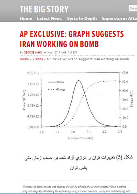
An article published by Associated Press about Iran's nuclear program has sparked controversy (screen shot of AP story)
(updated below w/AP's response)
It's important to return to the story about AP's nuclear Iran "exclusive" which I wrote about yesterday. Although it was intuitively obvious that the graph trumpeted by AP as scary and incriminating of Iran's nuclear program was actually a farce, there is now new, overwhelming, very compelling scientific evidence that is the case. Whether as victim or recklessly culpable participant, AP helped perpetrate a dangerous hoax, and owes an explanation and accounting for what took place, including identifying the "officials from a country critical of Iran's atomic program" who made false claims about what this is.
To begin with, the graph AP touted as reflecting some sort of nefarious, highly threatening and complex nuclear calculation is, in fact, widely available all over the Internet in the most innocuous places. Just consider this side-by-side comparison of the AP graph on the left, with the graph on the right on this harmless site designed to teach beginner users how to use Microsoft Excel:
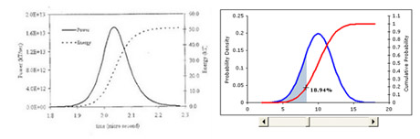
At the Bulletin of Atomic Scientists (BAS), Yousaf Butt and Ferenc Dalnoki-Veress on Wednesday night wrote: "Graphs such as the one published by the Associated Press can be found in nuclear science textbooks and on the Internet." Similarly, Prof. Muhammad Sahimi, a professor of chemical engineering at USC and expert in Iran's nuclear program, told Richard Silverstein of Tikun Olum that "too many graphs like this can be generated by a competent undergraduate student." So what AP presented to the world as some sort of highly complex, specialized document was, in fact, nothing more than a completely common graph easily found in all sorts of public venues.
Even worse, the calculations reflected on this graph are patently ridiculous. Butt and Dalnoki-Veress document that the graph "does nothing more than indicate either slipshod analysis or an amateurish hoax" [emphasis added]. That's because, they explain, "the diagram features quite a massive error, which is unlikely to have been made by research scientists working at a national level"; namely:
But AP never indicated that this error strongly suggested that no real nuclear scientist would have prepared it, and immediately went back in the very next paragraph to touting the document as some sort of scary evidence of Iran's threatening nuclear weapons machinations.
Then there's the obvious crudeness of the graph itself, which I noted yesterday. Professor Sahimi told Silverstein: "The graph itself looks low quality, as if it has been drawn by hand." And the Bulletin of Atomic Scientists authors noted the same thing: "the level of scientific sophistication needed to produce such a graph corresponds to that typically found in graduate- or advanced undergraduate-level nuclear physics courses." Indeed, they added: "no secrets are needed to produce the plot of the explosive force of a nuclear weapon - just straightforward nuclear physics" [emphasis in original]. They continued:
The obligation of journalists to protect the identity of their sources to whom they have pledged anonymity ends when the "sources" use them purposely to disseminate falsehoods. Indeed, the obligation to protect these sources not only ends, but a different obligation arises: to tell the public who fed them the hoax. This was exactly the issue that arose when it became clear that multiple sources had falsely told ABC News' Brian Ross in late 2001 that government tests had linked the anthrax attacks in the US to Saddam's chemical weapons program, a story that Ross spread far and wide - thus, as intended, heightening fears of Iraq, but which turned out to be completely false from start to finish. As numerous journalists argued then, Ross had the obligation to tell the public who was behind the hoax he so damagingly spread.
AP has that same obligation here. At the very least, they have the duty to respond to this scientific and documentary proof that the graph they trumpeted, and certainly the claims they made about it, are misleading in the extreme. On Wednesday afternoon, I asked AP to comment on these issues and have thus far received no response.
As both Shirazi and John Glaser document, the AP writer responsible for this absurdity, George Jahn, has a history of similar behavior. That includes producing an equally hyped and equally absurd report back in May featuring a cartoon-like drawing that, as Jahn put it, "was provided to The Associated Press by an official of a country tracking Iran's nuclear program who said it proves the structure exists, despite Tehran's refusal to acknowledge it."
As the Iraq War proved, there are few things more irresponsible and dangerous than having a large media outlet trumpet extremely dubious claims from anonymous sources designed to hype the threats posed by some targeted foreign regime. That is exactly what AP is doing here, and given how obvious the sham is, it is inexcusable. AP owes a clear explanation of what happened here.
The real story here is not this inane graph, but the behavior of AP and its "sources". That someone is purposely feeding this influential media outlet obvious hoaxes shows two facts: (1) the evidence of Iran's nuclear weapons program must be very thin if fabrications of this type are needed; and (2) someone from an unnamed country or countries is very eager to scare the public into believing this weapons program exists and is vigorously proceeding, and is willing to use fraud to advance those fear-mongering ends.
It's important to return to the story about AP's nuclear Iran "exclusive" which I wrote about yesterday. Although it was intuitively obvious that the graph trumpeted by AP as scary and incriminating of Iran's nuclear program was actually a farce, there is now new, overwhelming, very compelling scientific evidence that is the case. Whether as victim or recklessly culpable participant, AP helped perpetrate a dangerous hoax, and owes an explanation and accounting for what took place, including identifying the "officials from a country critical of Iran's atomic program" who made false claims about what this is.
To begin with, the graph AP touted as reflecting some sort of nefarious, highly threatening and complex nuclear calculation is, in fact, widely available all over the Internet in the most innocuous places. Just consider this side-by-side comparison of the AP graph on the left, with the graph on the right on this harmless site designed to teach beginner users how to use Microsoft Excel:
At the Bulletin of Atomic Scientists (BAS), Yousaf Butt and Ferenc Dalnoki-Veress on Wednesday night wrote: "Graphs such as the one published by the Associated Press can be found in nuclear science textbooks and on the Internet." Similarly, Prof. Muhammad Sahimi, a professor of chemical engineering at USC and expert in Iran's nuclear program, told Richard Silverstein of Tikun Olum that "too many graphs like this can be generated by a competent undergraduate student." So what AP presented to the world as some sort of highly complex, specialized document was, in fact, nothing more than a completely common graph easily found in all sorts of public venues.
Even worse, the calculations reflected on this graph are patently ridiculous. Butt and Dalnoki-Veress document that the graph "does nothing more than indicate either slipshod analysis or an amateurish hoax" [emphasis added]. That's because, they explain, "the diagram features quite a massive error, which is unlikely to have been made by research scientists working at a national level"; namely:
"The image released to the Associated Press shows two curves: one that plots the energy versus time, and another that plots the power output versus time, presumably from a fission device. But these two curves do not correspond: If the energy curve is correct, then the peak power should be much lower - around 300 million ( 3x10⁸) kt per second, instead of the currently stated 17 trillion (1.7 x10¹³) kt per second. As is, the diagram features a nearly million-fold error."This error is patently obvious to anyone versed in nuclear physics. Nima Shirazi yesterday spoke with Dr. M. Hossein Partovi, who teaches courses in thermodynamics and quantum mechanics at Sacramento State, and he echoed the BAS scientists:
"[Dr. Partovi], noting that the graph is plotted in microseconds, explains that 'the graph depicted in the report is a nonspecific power/energy plot that is primarily evidence of the incompetence of those who forged it: a quick look at the energy graph shows that the total energy is more than four orders of magnitude (forty thousand times) smaller than the total integrated power that it must equal!'"Notably, the nuclear expert quoted by AP in its article, David Albright, also seemed to be trying to tell AP that the graph contained this same obvious, glaring error, yet AP - eager to believe, or at least lead others to believe, that it had some incriminating evidence - either failed or refused to understand its significance. Buried in the AP article was this passage:
"'The yield is too big,' Albright said, noting that North Korea's first tests of a nuclear weapon were only a few kilotons."
But AP never indicated that this error strongly suggested that no real nuclear scientist would have prepared it, and immediately went back in the very next paragraph to touting the document as some sort of scary evidence of Iran's threatening nuclear weapons machinations.
Then there's the obvious crudeness of the graph itself, which I noted yesterday. Professor Sahimi told Silverstein: "The graph itself looks low quality, as if it has been drawn by hand." And the Bulletin of Atomic Scientists authors noted the same thing: "the level of scientific sophistication needed to produce such a graph corresponds to that typically found in graduate- or advanced undergraduate-level nuclear physics courses." Indeed, they added: "no secrets are needed to produce the plot of the explosive force of a nuclear weapon - just straightforward nuclear physics" [emphasis in original]. They continued:
"Though the image does not imply that computer simulations were actually run, even if they were, this is the type of project a student could present in a nuclear-science course. The diagram simply shows that the bulk of the nuclear fission yield is produced in a short, 0.1 microsecond, pulse. Since the 1950s, it has been standard knowledge that, in a fission device, the last few generations of neutron multiplication yield the bulk of the energy output. It is neither a secret, nor indicative of a nuclear weapons program."It is, to put it as generously as possibly, completely reckless for AP to present this primitive, error-strewn, thoroughly common graph as secret, powerful evidence of Iran's work toward building a nuclear weapon. Yet from its inflammatory red headline ("AP EXCLUSIVE: GRAPH SUGGESTS IRAN WORKING ON BOMB") to the end of the article, this is exactly what AP did. And it did so by mindlessly repeating the script handed to it by a country which AP acknowledged is seeking to warn the world about the dangers of Iran. This is worse than stenography journalism. It is AP allowing itself, eagerly and gratefully, to be used to put its stamp of credibility on a ridiculous though destructive hoax.
The obligation of journalists to protect the identity of their sources to whom they have pledged anonymity ends when the "sources" use them purposely to disseminate falsehoods. Indeed, the obligation to protect these sources not only ends, but a different obligation arises: to tell the public who fed them the hoax. This was exactly the issue that arose when it became clear that multiple sources had falsely told ABC News' Brian Ross in late 2001 that government tests had linked the anthrax attacks in the US to Saddam's chemical weapons program, a story that Ross spread far and wide - thus, as intended, heightening fears of Iraq, but which turned out to be completely false from start to finish. As numerous journalists argued then, Ross had the obligation to tell the public who was behind the hoax he so damagingly spread.
AP has that same obligation here. At the very least, they have the duty to respond to this scientific and documentary proof that the graph they trumpeted, and certainly the claims they made about it, are misleading in the extreme. On Wednesday afternoon, I asked AP to comment on these issues and have thus far received no response.
As both Shirazi and John Glaser document, the AP writer responsible for this absurdity, George Jahn, has a history of similar behavior. That includes producing an equally hyped and equally absurd report back in May featuring a cartoon-like drawing that, as Jahn put it, "was provided to The Associated Press by an official of a country tracking Iran's nuclear program who said it proves the structure exists, despite Tehran's refusal to acknowledge it."
As the Iraq War proved, there are few things more irresponsible and dangerous than having a large media outlet trumpet extremely dubious claims from anonymous sources designed to hype the threats posed by some targeted foreign regime. That is exactly what AP is doing here, and given how obvious the sham is, it is inexcusable. AP owes a clear explanation of what happened here.
The real story here is not this inane graph, but the behavior of AP and its "sources". That someone is purposely feeding this influential media outlet obvious hoaxes shows two facts: (1) the evidence of Iran's nuclear weapons program must be very thin if fabrications of this type are needed; and (2) someone from an unnamed country or countries is very eager to scare the public into believing this weapons program exists and is vigorously proceeding, and is willing to use fraud to advance those fear-mongering ends.
UPDATE
Here, in its entirety, is the response sent by AP to all of the objections raised to its story:"We continue to report this story."It's hard to decide which is worse: the original story or their "response" to the very serious flaws in their reporting.


No comments:
Post a Comment